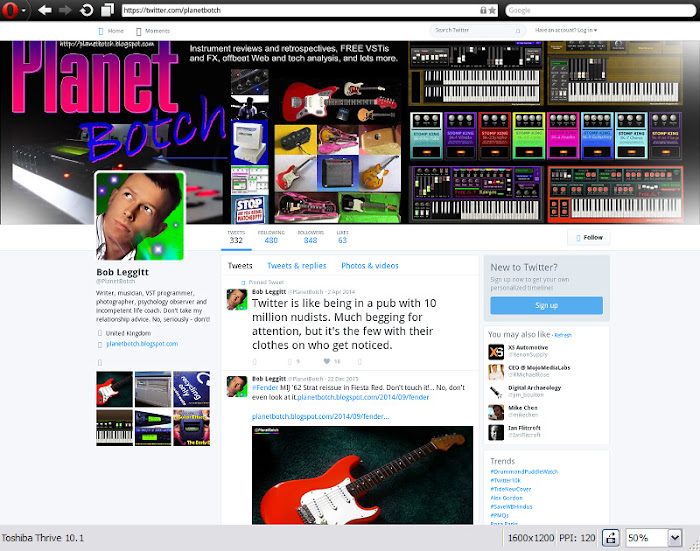
If you dabble in web design, you’ll know it’s now a prerequisite that your work accommodates visitors using small devices. But what if you discover that a significant proportion of your visitors use large desktop monitors? Well, this is a discovery I recently made in relation to one of my sites. I wanted to give those hi-resolution users some extra options and space things out a little for very large screens, but the problem was that my own desktop monitor was smaller than the ones I was designing for.
It was whilst in the process of sorting out a workaround, that I realised there wasn’t much, if any advice online for those needing to design for larger screens than their own. I thought, then, that it was worth me putting up this brief post offering a solution.
Ironically, it’s actually a SMALL device tester that’s come to the rescue, in the shape of the Opera Mobile Classic Emulator. You can download it via the link below…
Opera Mobile Classic Emulator
The Opera Mobile Emulator allows you to simulate small device displays on a desktop PC or Mac (it also has a Linux version). But the software’s genius is that it allows you to condense the simulated display to half, or even a quarter of its actual size. Therefore, you can fit, say, a 1920px resolution page onto a 1536px resolution screen, or even a 1024.
Better still, Opera’s emulator shows the precise dimensions of the display it’s simulating. If you look at the capture heading this post you’ll see the resolution denoted at the bottom right: 1024 x 716.
As preset, the highest res is 1280px across (this is, afterall, supposed to be a mobile emulator), but if you drag the borders of the simulation window outward to make it larger, not only will you be able to increase that 1280px width – you’ll also see exactly what the new width is. So you can easily test a responsive blog or website design theme with the whole range of device widths from very large to very small, just by dragging the window boundaries inward or outward.
USING THE SOFTWARE
You’ll need to take a moment (and it really is just a moment) to prepare the software before you use it, since the Pixel Density parameter is critically important in accurate simulation. I’m a Windows user so I can’t say what happens with other operating systems, but the pixel density required for an accurate simulation of desktop monitors in my tests was 120. This was the lowest option, importantly, adding zero zoom, and thus maintaining a 1 to 1 representation. Using any Pixel Density other than 120, my simulation misrepresented what would happen on a real desktop monitor of the specified resolution.
Your preparation takes place in the initial software dialogue, which appears automatically when you fire up the program.
It doesn’t really matter which resolution you initially select, because once your simulation is running, you can drag the borders anywhere you like to amend the simulated screen size. But you will, as I say, need to set the Pixel Density to 120 (none of the default device options had this setting), and of course, if the display size you want to test is bigger than your own monitor’s res, ensure that the Window Scale is set to 50%.

I used the Toshiba Thrive 10.1 simulation as a starting point for my tests. With the parameters amended as above, and the window borders dragged to the required sizes, it gave me accurate representations of real desktop monitor behaviour. My opening dialogue box is shown above.
Obviously, a simulator is not going to deliver perfect results every time, so you may want to check your work on a real large monitor if that’s possible. But this is incredibly useful if you work on a laptop or tablet, perhaps on the move. Or, of course, if you don’t own a monitor that will reproduce the maximum resolutions you want to design for.
This isn’t massively different in principle from zooming out using the zoom facility on an ordinary browser. But an ordinary browser won’t give you a readout of the screen dimensions you’re simulating, and neither will it give you such an easy and smooth vision of your web page’s behaviour from maximum width to minimum. Regular browser zoom increases or decreases in steps. You can still drag your window borders around, of course, but you don’t really know where your jumping-off points are. The Opera Mobile Emulator was easily the best solution I was able to find. Here's how it simulated my Twitter page at 1600 x 1200 - half size, so just 800 pixels across...


